Dutch Magic
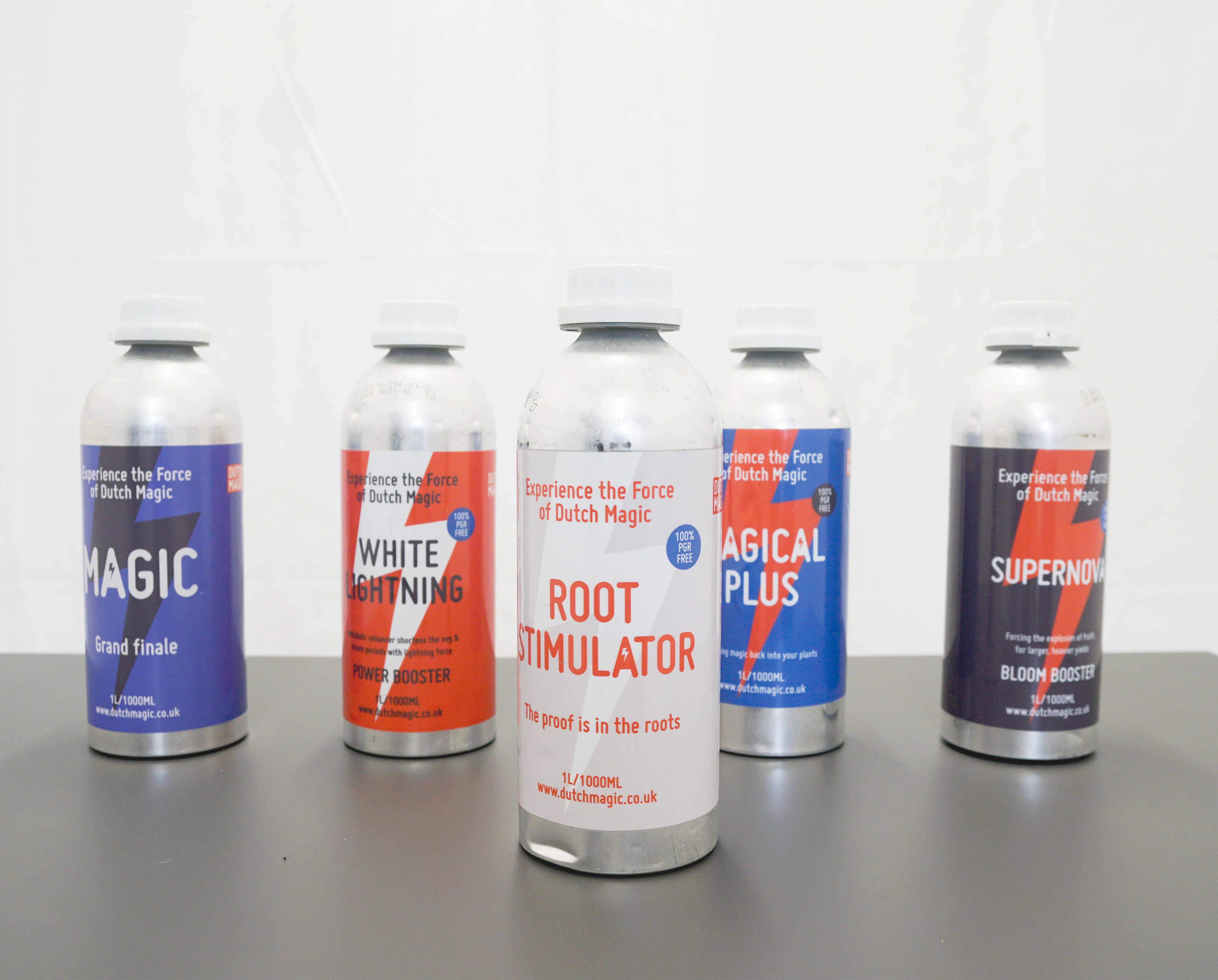
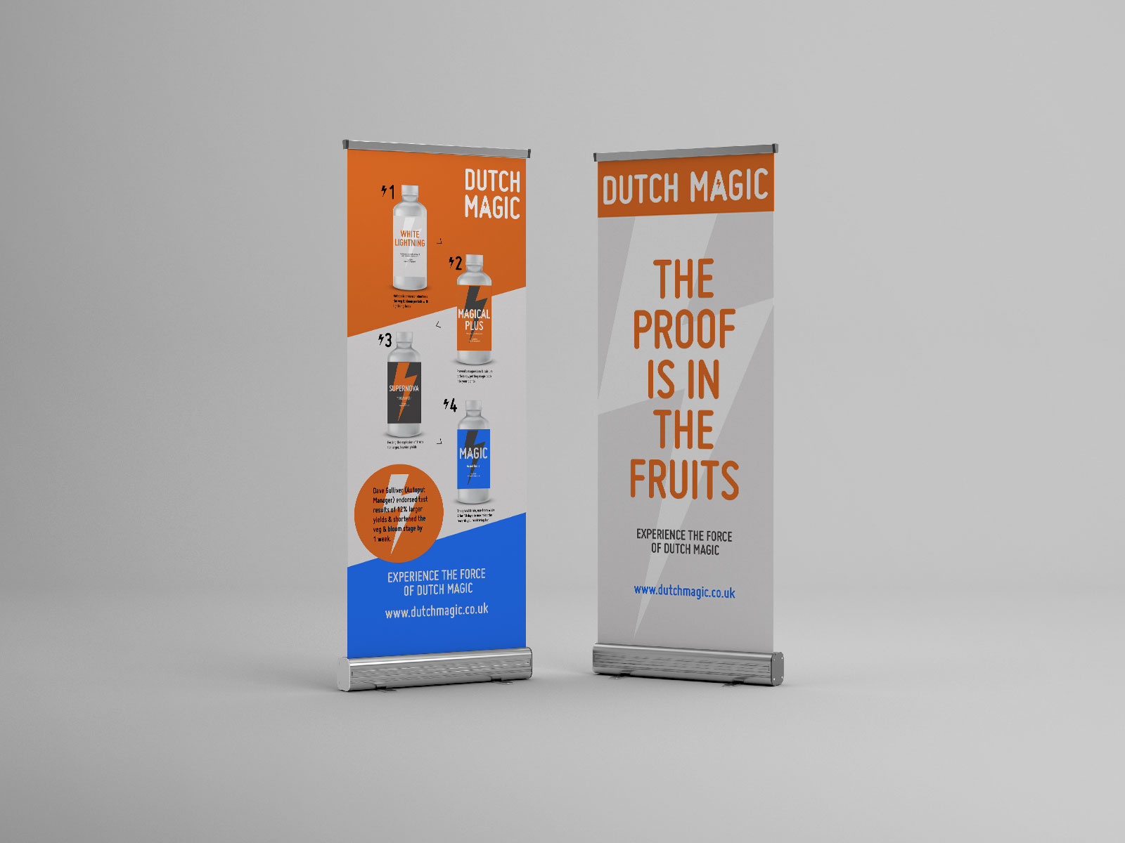
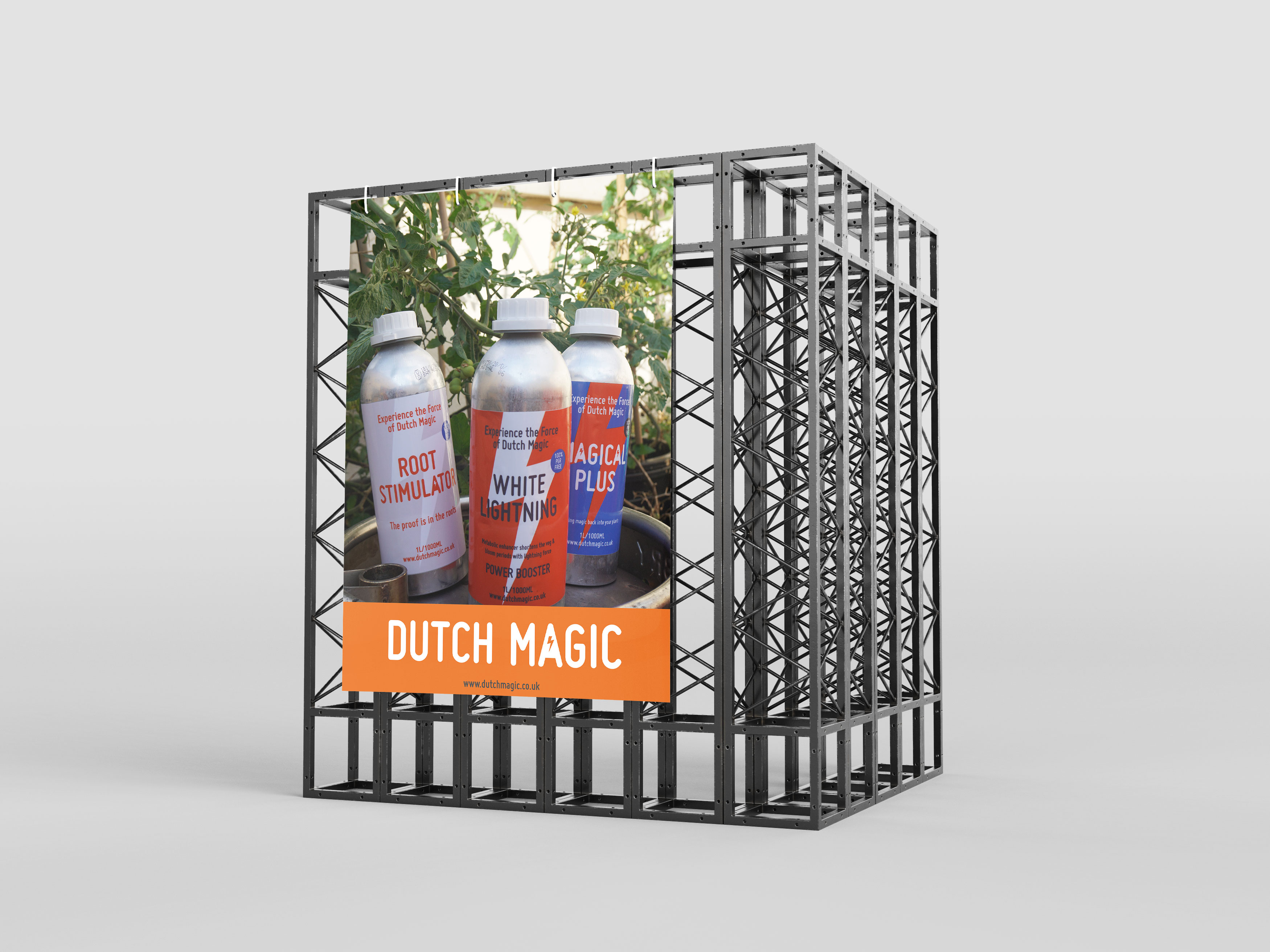
Branding & packaging Design for a organic hydroponic solution by Dutch Magic.
The client was looking for a design which offered an organic twist & feel on the saturated design trends of the hydroponic world.
Branding & packaging Design for a organic hydroponic solution by Dutch Magic.
The client was looking for a design which offered an organic twist & feel on the saturated design trends of the hydroponic world.


Appealing to the masses of farmers and gardeners out there with a product which has a USP of being organic and 100% PGR free meant the branding had room for a bit of grit when it came to imagery. A contrast to the paired back graphics & colour palette.
The audience had proved to be in tune with current trends when it came to design and packaging for other products they were interested in so why not their plant fertiliser?
A product they can trust to boost their yield!
The audience had proved to be in tune with current trends when it came to design and packaging for other products they were interested in so why not their plant fertiliser?
A product they can trust to boost their yield!

